Layout ManagersJ8 Home « Layout Managers
In previous lessons we have seen several code examples where we use layout managers to position our Swing components without going into details about the layout manager used. In this lesson we remedy this by taking an in-depth look at several layout managers we can use to organise the components within our GUIs, but first we will answer a few questions:
- What is a layout manager?
A layout manager is a Java object associated with a component, generally a background component. - What does a layout manager do?
A layout manager controls the size and placement of any components attached to the component it is associated with. - Why so many layout managers?
Each layout manager arranges the components attached to it according to its own policy giving us more flexibility when designing our GUIs. - Can we change the default layout manager that is set for a component?
Yes we can.
As an example a JFrame has a JPanel attached to it's BorderLayout and the JPanel has a JButton and JComboBox
attached to it. The layout manager of the JPanel controls the size and placement of the JButton and JComboBox within the JPanel. The layout manager of the
JFrame controls the size and placement of the JPanel within the JFrame. Components are attached to other components via the add() method. In most cases this
means adding an interactive component like a button to a background component like a pane or panel. Remember we never add directly to top-level containers such as a JFrame.
The table below lists the most common layout managers and are the ones we cover in this lesson. Click a link in the table to go to detailed information on the layout manager you're interested in.
| Class | Description |
|---|---|
BorderLayout | Divides the background component into five regions and one component can be placed into each region. Components using this layout don't generally get their preferred size. This is the default layout manager for the content pane of JFrame and JDialog. |
FlowLayout | Components are placed within successive rows within the container from left to right fitting as many components as possible within each
row and wrapping components that don't fit onto the next row and so on. Components using this layout get their preferred size. This is the default layout manager for the JPanel container class. |
BoxLayout | Components can be arranged horizontally or vertically and one per line or wrapped, although usually used for vertical layout with one component
per line. With this layout components generally get their preferred size but can be clipped or enlarged to conform where necessary. This is the default layout manager for the Box container class. |
GridLayout | Components are placed within a rectangular grid containing the number of rows and columns specified. Components using this layout get their preferred size and the grid will grow to accomodate new components. |
GridBagLayout | Components are placed within rows and columns like the GridLayout but the number of rows and columns can vary making this the
most versatile of the layout managers. The versatility comes at a cost and this is also the most complicated layout to use.The size of a component using this layout is set by the constraints specified for it. |
BorderLayout Top
The BorderLayout layout manager divides the container it is attached to into five regions where one component can be placed into each region, these being NORTH. SOUTH,
WEST, EAST and CENTER. These regions are defined as final static constants within the BorderLayout class. Components using BorderLayout
generally don't get their preferred size.
The way it works with this layout manager is that if the NORTH or SOUTH regions are specified then these extend to fill the entire width of the frame in their region and are as high
as they need to be to accomodate the characters in their labels. If the WEST or EAST regions are specified then these are as wide as they need to be to accomodate the characters in
their labels and as high as the remaining space left after the NORTH or SOUTH region components have been added. If no NORTH or SOUTH region components have
been added then the WEST and EAST regions are the height of their container. The CENTER region component fills up the remaining space in the container.
In the following example we create four buttons for all regions except NORTH.
package info.java8;
import javax.swing.JFrame;  // An interactive window
import javax.swing.JButton; // An interactive button
import java.awt.*; // AWT Toolkit

public class BorderLayoutExample extends JFrame {
    // Construct the frame
    public BorderLayoutExample () {
        super("Using BorderLayout");
        setBounds(300, 200, 568, 218);
        setDefaultCloseOperation(JFrame.EXIT_ON_CLOSE);
        setVisible(true);
    }

    public static void main (String[] args) {
        BorderLayoutExample ble = new BorderLayoutExample();
        // Create 2 buttons
        JButton jb1 = new JButton("JButton 1");
        JButton jb2 = new JButton("JButton 2");
        JButton jb3 = new JButton("JButton 3 -  This label is a lot bigger");
        JButton jb4 = new JButton("JButton 4");
        // Add the buttons directly to four regions of the BorderLayout of the frame
        ble.add(BorderLayout.SOUTH, jb1);
        ble.add(BorderLayout.WEST, jb2);
        ble.add(BorderLayout.EAST, jb3);
        ble.add(BorderLayout.CENTER, jb4);
    }
}
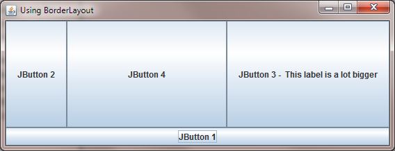
The following screenshot shows the results of compiling and running the BorderLayoutExample class. The buttons we have created are added directly to the various regions of the frame. Notice that
the SOUTH region specified extends to fill the entire width of the frame and is as high as needed to accomodate the characters in its label. The EAST and WEST regions are
are as wide as they need to be to accomodate the characters in their labels and as high as the remaining space left after the SOUTH region component has been added. The CENTER
region component fills up the remaining space in the container.
FlowLayout Top
With the FlowLayout layout manager components are placed within successive rows within the container, by default flowing from left to right, fitting as many components as possible within each row
and wrapping components that don't fit onto the next row and so on. We can also change the orientation so components flow from right to left. The FlowLayout class also provides five
final static constants which allow us to align components in the following ways LEFT, RIGHT, CENTER, LEADING and TRAILING. Components
using this layout get their preferred size. This is the default layout manager for the JPanel container class. A typical usage for the FlowLayout layout manager would be to arrange
several buttons within a panel.
In the following example we create three panels and add five buttons to each. We then add the panels to different regions of the frame.
package info.java8;
import javax.swing.JFrame;  // An interactive window
import javax.swing.JButton; // An interactive button
import javax.swing.JPanel; // A container for our buttons
import java.awt.*; // AWT Toolkit

public class FlowLayoutExample extends JFrame {
    // Construct the frame
    public FlowLayoutExample () {
        super("Using Flow Layout");
        setBounds(300, 200, 568, 218);
        setDefaultCloseOperation(JFrame.EXIT_ON_CLOSE);
        setVisible(true);
    }

    public static void main (String[] args) {
        FlowLayoutExample fle = new FlowLayoutExample();
        // Create some panels with different backgrounds
        JPanel panel1 = new JPanel();
        panel1.setBackground(Color.BLUE);
        JPanel panel2 = new JPanel();
        panel2.setBackground(Color.RED);
        JPanel panel3 = new JPanel();
        panel3.setBackground(Color.GREEN);
        // Create 5 buttons and add them to the panels
        for (int i=1; i<6; i++) {
            panel1.add(new JButton("JButton " + i));
            panel2.add(new JButton("JButton " + i));
            panel3.add(new JButton("JButton " + i));
        }
        // Add the panel to three regions of the BorderLayout of the frame
        fle.add(BorderLayout.NORTH, panel1);
        fle.add(BorderLayout.WEST, panel2);
        fle.add(BorderLayout.EAST, panel3);
    }
}
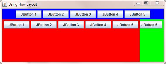
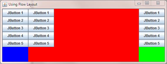
The following screenshot shows the results of compiling and running the FlowLayoutExample class. When we move the buttons into each panel the widths of the panels increase to fit all the buttons
horizontally as there are no dimensions set and so no wrapping occurs. So when we move each panel into the different regions of the BorderLayout area of the frame it tries to fit in the whole width
of each panel into each region. There is no problem fitting the panels into the NORTH and WEST regions. The EAST region gets whatever space is left.
The following screenshot shows the results of switching round the last two lines of code of the the FlowLayoutExample class. This time the EAST region is specified first and so gets
the space it needs and the WEST region gets whatever is left. Hopefully you can see how all the space gets used by comparing the two screenshots. Of course if you maximize the windows to full screen
then there will be plenty of room to accomodate all the buttons and you will also see the spare space left for the CENTER region.
package info.java8;
        ....
        fle.add(BorderLayout.EAST, panel3);
        fle.add(BorderLayout.WEST, panel2);
    }
}
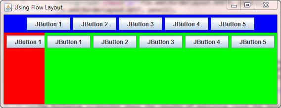
The example highlights some of the vagaries of using layout managers; although the FlowLayout layout manager will wrap components to a new line it needs dimensions to know when to do this.
Lets look at an example of using this layout where we use it for a frame instead of the default BorderLayout layout manager.
package info.java8;
import javax.swing.JFrame;  // An interactive window
import javax.swing.JButton; // An interactive button
import java.awt.*; // AWT Toolkit

public class FlowLayoutExampleB extends JFrame {
    // Construct the frame
    public FlowLayoutExampleB () {
        super("Using Flow Layout On The Frame");
        setBounds(300, 200, 568, 218);
        setDefaultCloseOperation(JFrame.EXIT_ON_CLOSE);
        setVisible(true);
    }

    public static void main (String[] args) {
        FlowLayoutExampleB fleb = new FlowLayoutExampleB();
        // Get a reference to the content pane of the frame
        Container contentPane = fleb.getContentPane();
        // Create a FlowLayout layout manager
        FlowLayout fl = new FlowLayout();
        // Set content pane of our frame to the FlowLayout layout manager
        contentPane.setLayout(fl);
        // Create 7 buttons and add them to the panels
        for (int i=1; i<8; i++) {
            contentPane.add(new JButton("JButton " + i));
        }
    }
}
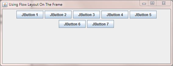
The following screenshot shows the results of compiling and running the FlowLayoutExampleB class. We get a reference to our containers content pane using the getContentPane() method.
After this we create a new FlowLayout object and assign this to our container reference named contentPane. Our frame now has a flow layout manager. We then create seven buttons and
add them to our container. This time the buttons are wrapped because the flow layout manager knows the dimensions of the frame and so works out how many buttons fit onto each line and where to put them using
the defaults for this layout manager of left to right and centered.
BoxLayout Top
When using the BoxLayout layout manager components can be arranged horizontally or vertically and one per line or wrapped. In practice we usually use the BoxLayout layout manager for
vertical layouts with one component per line and use the FlowLayout layout manager for horizontally positioned components. With this layout components generally get their preferred size but can be
clipped or enlarged to conform where necessary. This is the default layout manager for the Box container class.
In the following example we create three panels, set their layouts to BoxLayout and add five buttons to each. We then add the panels to different regions of the frame.
package info.java8;
import javax.swing.JFrame;  // An interactive window
import javax.swing.JButton; // An interactive button
import javax.swing.JPanel; // A container for our buttons
import javax.swing.BoxLayout; // A BoxLayout layout manager
import java.awt.*; // AWT Toolkit

public class BoxLayoutExample extends JFrame {
    // Construct the frame
    public BoxLayoutExample () {
        super("Using Flow Layout");
        setBounds(300, 200, 568, 218);
        setDefaultCloseOperation(JFrame.EXIT_ON_CLOSE);
        setVisible(true);
    }

    public static void main (String[] args) {
        BoxLayoutExample ble = new BoxLayoutExample();
        // Create some panels with different backgrounds and give them a BoxLayout
        JPanel panel1 = new JPanel();
        panel1.setBackground(Color.BLUE);
        panel1.setLayout(new BoxLayout(panel1, BoxLayout.Y_AXIS));
        JPanel panel2 = new JPanel();
        panel2.setBackground(Color.RED);
        panel2.setLayout(new BoxLayout(panel2, BoxLayout.Y_AXIS));
        JPanel panel3 = new JPanel();
        panel3.setBackground(Color.GREEN);
        panel3.setLayout(new BoxLayout(panel3, BoxLayout.Y_AXIS));
        // Create 5 buttons and add them to the panels
        for (int i=1; i<6; i++) {
            panel1.add(new JButton("JButton " + i));
            panel2.add(new JButton("JButton " + i));
            panel3.add(new JButton("JButton " + i));
        }
        // Add the panel to three regions of the BorderLayout of the frame
        ble.add(BorderLayout.WEST, panel1);
        ble.add(BorderLayout.CENTER, panel2);
        ble.add(BorderLayout.EAST, panel3);
    }
}
The following screenshot shows the results of compiling and running the BoxLayoutExample class. After we have created each panel we set a different background and then set the layout manager
for each panel to the BoxLayout layout manager. We set all the panels to the BoxLayout.Y_AXIS constant for vertical alignment and add some buttons to each panel. We them move the
panels to three regions of the frames BorderLayout layout manager.
GridLayout Top
When using the GridLayout layout manager components are placed within a rectangular grid containing the number of rows and columns specified or just single rows if no rows or columns are specified.
We can also construct our rectangular grids with vertical or horizontal padding between components if required. Components using this layout get their preferred size and the grid will grow to accomodate new components.
In the following example we create three panels, set their layouts to the three different GridLayout constructors and add six buttons to each. We then add the panels to different regions of the frame.
package info.java8;
import javax.swing.JFrame;  // An interactive window
import javax.swing.JButton; // An interactive button
import javax.swing.JPanel; // A container for our buttons
import java.awt.*; // AWT Toolkit

public class GridLayoutExample extends JFrame {
    // Construct the frame
    public GridLayoutExample () {
        super("Using Grid Layout");
        setBounds(300, 200, 568, 218);
        setDefaultCloseOperation(JFrame.EXIT_ON_CLOSE);
        setVisible(true);
    }

    public static void main (String[] args) {
        GridLayoutExample gle = new GridLayoutExample();
        // Create some panels with different backgrounds and give them a BoxLayout
        JPanel panel1 = new JPanel();
        panel1.setBackground(Color.BLUE);
        panel1.setLayout(new GridLayout(2, 3));
        JPanel panel2 = new JPanel();
        panel2.setBackground(Color.RED);
        panel2.setLayout(new GridLayout());
        JPanel panel3 = new JPanel();
        panel3.setBackground(Color.GREEN);
        panel3.setLayout(new GridLayout(2, 3, 30, 30));
        // Create 3 buttons and add them to the panels
        for (int i=1; i<4; i++) {
            panel1.add(new JButton("JButton " + i));
            panel2.add(new JButton("JButton " + i));
            panel3.add(new JButton("JButton " + i));
        }
        // Add the panel to three regions of the BorderLayout of the frame
        gle.add(BorderLayout.WEST, panel1);
        gle.add(BorderLayout.CENTER, panel2);
        gle.add(BorderLayout.EAST, panel3);
    }
}
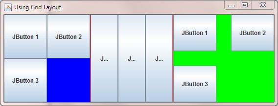
The following screenshot shows the results of compiling and running the GridLayoutExample class. After we have created each panel we set a different background and then set each panel to the
GridLayout layout manager using different GridLayout constructors for each. We then add some buttons to each panel and move the panels to three regions of the frames
BorderLayout layout manager. As you can see we get varying results from the constructors and parameters passed to them but the actual components within each panel are always the same size.
GridBagLayout Top
The second grid based layout manager we can use in Java is the GridBagLayout. Components are placed within rows and columns like the GridLayout but the number of components in each row or
column can vary in size and can be aligned vertically, horizontally or along their baseline making this the most versatile of the layout managers. Each component is associated with an instance of GridBagConstraints.
The GridBagConstraints object specifies a component's size and where its displayable area should be located and positioned on the rectangualr grid. The versatility comes at a cost and this is also the most
complicated layout to use.
The following table shows all eleven constraints you can use for sizing and position components within the grid.
| Constraint | Description |
|---|---|
anchor | Determines component positioning within its display area when component is smaller than its display area. absolute values are: CENTER (default), NORTH, NORTHEAST, EAST, SOUTHEAST, SOUTH, SOUTHWEST, WEST, and NORTHWEST orientation relative values are: PAGE_START, PAGE_END, LINE_START, LINE_END, FIRST_LINE_START, FIRST_LINE_END, LAST_LINE_START and LAST_LINE_END baseline relvative values are: BASELINE, BASELINE_LEADING, BASELINE_TRAILING, ABOVE_BASELINE, ABOVE_BASELINE_LEADING, ABOVE_BASELINE_TRAILING, BELOW_BASELINE, BELOW_BASELINE_LEADING, and BELOW_BASELINE_TRAILING. |
fill | Determines if and how to resize the component to fill its display area when component is smaller than its display area. NONE: Do not resize the component (default). HORIZONTAL: Widen component to fill display area horizontally, but do not change height. VERTICAL: Highten component to fill its display area vertically, but do not change width. BOTH: Widen and heighten component to completely fill display area. |
gridheight & gridwidth | Determines the size of the component area within the container. Default values are 1. |
gridx & gridy | Determines the position of the component within the container via its grid coordinates. 0,0 is top-left of grid.
Default value is RELATIVE for both which places the component immediately following the last component added for gridx or immediately below the last component added for gridy. |
insets | Determines the amount of padding between the component and the boundary of its display area. Default value is new Insets(0, 0, 0, 0) Setting order is top, left, bottom and right. |
ipadx & ipady | Determines an increase in component size above it's minimum size. default values are 0. |
weightx & weighty | Determines how free space is distributed between components within the container. default values are 0. |
In the following example we add two buttons of different sizes to a GridBagLayout.
package info.java8;
import javax.swing.JFrame;  // An interactive window
import javax.swing.JButton; // An interactive button
import java.awt.*; // AWT Toolkit

public class GridBagLayoutExample {
    public static void main (String[] args) {
        JFrame gble = new JFrame("Using GridBagLayout");
        gble.setBounds(300, 200, 568, 218);
        // Create a GridBagLayout
        GridBagLayout gridBag = new GridBagLayout();
        // Create a GridBagConstraints object for component positioning
        GridBagConstraints c = new GridBagConstraints();
        // Set our frame to a GridBagLayout
        gble.setLayout(gridBag);
        // Set our frame to a GridBagLayout
        gble.setLayout(gridBag);
        // Set all components to left justified
        c.anchor = GridBagConstraints.WEST;
        // Set first component with other constraints as default
        JButton JB1 = new JButton("Button 1 has a very long label");
        gridBag.setConstraints(JB1, c);
        gble.add(JB1);
        // Set second component to fill remaining space on first line
        c.gridwidth = GridBagConstraints.REMAINDER;
        JButton JB2 = new JButton("Button 2");
        gridBag.setConstraints(JB2, c);
        gble.add(JB2);

        gble.setDefaultCloseOperation(JFrame.EXIT_ON_CLOSE);
        gble.pack();
        gble.setVisible(true);
    }
}
The following screenshot shows the results of compiling and running the GridBagLayoutExample class. We set our frame to the GridBagLayout object we create and then instantiate a
GridBagConstraints object that we will use to position our components. We set the constraints anchor to WEST which left justifies our components and add a button to our frame using
this and the rest of the constraints as default. We than add a second button to our frame in the remaining horizontal space. Other points of interest are the the pack() method which sizes the
frame to fit the preferred size and layouts of its subcomponents and how on this occasion we don't subclass JFrame and just instantiate it within the main() method.

Lets take a look at another example where we add several buttons of varying sizes to a GridBagLayout while using a few more constraints.
package info.java8;
import javax.swing.JFrame;  // An interactive window
import javax.swing.JButton; // An interactive button
import java.awt.*; // AWT Toolkit

public class GridBagLayoutExample2 {
    public static void main (String[] args) {
        JFrame gble = new JFrame("Using GridBagLayout 2");
        gble.setBounds(300, 200, 568, 218);
        // Create a GridBagLayout
        GridBagLayout gridBag = new GridBagLayout();
        // Create a GridBagConstraints object for component positioning
        GridBagConstraints c = new GridBagConstraints();
        // Set our frame to a GridBagLayout
        gble.setLayout(gridBag);
        // Set our frame to a GridBagLayout
        gble.setLayout(gridBag);
        // Set all components to right justified
        c.anchor = GridBagConstraints.WEST;
        // Set first component double height and other constraints as default
        c.gridheight = 2;
        JButton JB1 = new JButton("Button 1");
        gridBag.setConstraints(JB1, c);
        gble.add(JB1);

        // Set second component to fill remaining space on first line
        c.gridwidth = GridBagConstraints.REMAINDER;
        c.gridheight = 1;
        JButton JB2 = new JButton("Button 2 has a very long label");
        gridBag.setConstraints(JB2, c);
        gble.add(JB2);

        // Set third component to fill remaining space on second line
        JButton JB3 = new JButton("Button 3");
        gridBag.setConstraints(JB3, c);
        gble.add(JB3);

        gble.setDefaultCloseOperation(JFrame.EXIT_ON_CLOSE);
        gble.pack();
        gble.setVisible(true);
    }
}
The following screenshot shows the results of compiling and running the GridBagLayoutExample2 class. We set our frame to the GridBagLayout object we create and then instantiate a
GridBagConstraints object that we will use to position our components. We set the constraints anchor to WEST which left justifies our components and add a button to our frame using
this, double height and the rest of the constraints as default. Button 1 gets its preferred size and is padded top and bottom. We than add two more buttons to our frame in the remaining horizontal space.

We set our frame to the GridBagLayout object we create and then instantiate a
GridBagConstraints object that we will use to position our components. We set the constraints anchor to WEST which left justifies our components and add a button to our frame using
this, double height and the rest of the constraints as default. Button 1 gets its preferred size and is padded top and bottom. We than add two more buttons to our frame in the remaining horizontal space.
The following screenshot shows the results of compiling and running the GridBagLayoutExample2 class and adding the following line of code:
package info.java8;
        ...
        // Set first component double height and other constraints as default
        c.gridheight = 2;
        // Extra line of code follows
        c.fill = GridBagConstraints.BOTH;
        }
        ...
}
As you can see from the screenshot below empty space around the buttons has been filled in.

With all the various constraints available you get a great deal of flexibility when using the GridBagLayout so it's worth the initial investment in time to get to know this layout manager. There
are several other layout managers such as CardLayout but these are not covered on this site.
Lesson 5 Complete
In this lesson we looked at several layout managers we can use to organise the components within our GUIs.
What's Next?
We also need to make our GUIs interactive so what we require is a mechanism where we are alerted to a user event, such as a button being clicked, and make a response to it. In the next lesson we look at how to intercept user events and action them, which is known as event handling.